
Concept.
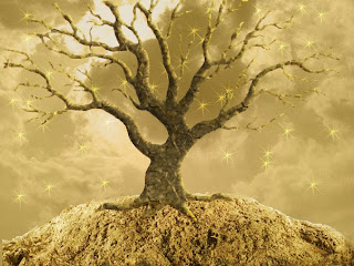
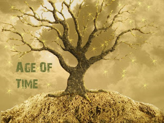
My idea was to create something so amazing it would take time to understand, understanding isn't one glance and you know what it is, Art is about making the people look at your master piece over and over until they've had enough, and had a idea about what it was. Then the idea of why not having a tree in space, on top of a planet? The idea is unique, interesting, and complex. For one, a dead a tree to simplify frozen life, and a planet to create space around it. A tree in empty space. Where life began, life had to start somewhere from a seed, in a flower, into a tree, it's a cycle of life, this tree could represent life restarting again on a different space. I wanted to make a unique tree in a middle of nowhere, I wanted to create something so unique it would take time so understand. This is surrealism because the tree is in the middle of nowhere, nothing surrounding it except for sky and ground, trying to make it in space , no living humans, no animals, just a tree with clouds. Surrealism is about making something realistic and putting it in a impossible position, and thats what i tried to do with this project
Procedure.
The two items in my surrealism art piece were photographed by me, the texture of the sand, and the sky with the clouds .The dead tree and the shape that creates my foreground for the tree, were pictures taken from Google Images. Finding the right tools to edit took a long time but when you have internet and YouTube, you can basically find everything you need to know about Photoshop. Overlaying, blurring, black+white, cropping. With the Magnetic Lasso Tool it was a big step to cropping out the tree but had to be very still and patient for that to work. After cropping out the tree, I got the picture of the sky clicked Image-Adjustments-Black+white and played around with the percentages in overlay and went to about 60% to create this sepia look. Once I got the background set along with the tree, I went on to the foreground which was kind of tricky, but finally managed to get with a outline, then importing my picture of sand, and textured it a little, now with the foreground and background set, I did stars to make the tree look ancient and like it had some sort of magic power holding it. After putting everything together from the foreground to the background we need to a titles to make it complete. So I named it “Age of Time”, because of the ancient tree in a lost world of nothing filled with nothing but space. While editing this tree I had to look about the color of the tree the color of the background and the color of the title. So I chose a light brown type color because the brown could represent old age, something old but not necessarily unique. Trying to make this tone precise and perfect as possible took time, and patient's because without it would look all sloppy and un proportioned. Using the Magnetic Tool, Filter Blur, Healing Tool, Crop Tool, Horizontal Type Tool, and the Eraser Tool, helped me to finish this project, without it all I could have finished this project
Conclusion
With my surrealism project I was pretty satisfied with the final result because now I am little bit more informed of how to use Photoshop and so in the future I will probably be able to do the same thing without looking at videos and blogs and try doing it my own way. The easiest thing about doing this was doing the editing but cropping and erasing and making the outline of the dead tree really precise was the hardest part. Some things I could make my surrealism project better by was taking more time and doing the text better and more authentic. Using the eraser tool more properly and being more patient with it could of helped me smooth out the sides, and make it more clear. Making the tree more clear gives it depth and more meaning into it, so that would of been one thing that i could of improved.


